Accurate beats nice
In data visualisation, accurate beats nice every single time.
The designers of this chart thought it would look nicer to have rounded curves in between data points:
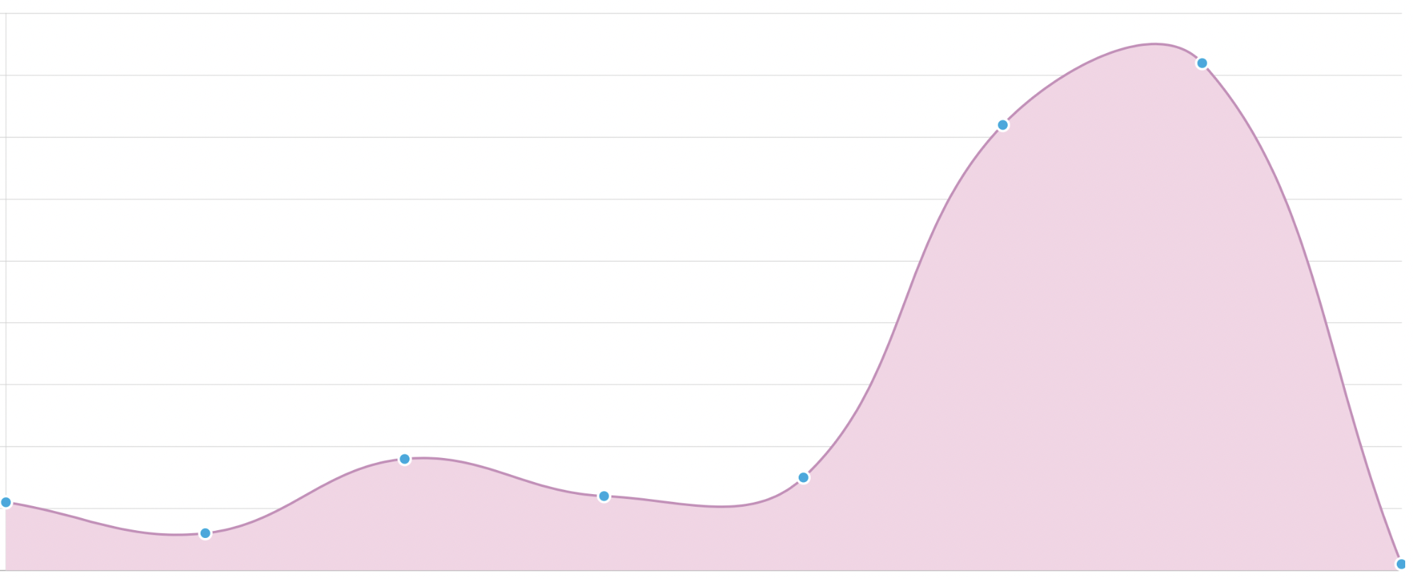
Only that the chart, which visualizes downloads per day, is now inaccurate. It suggests that the peak number of downloads is here:
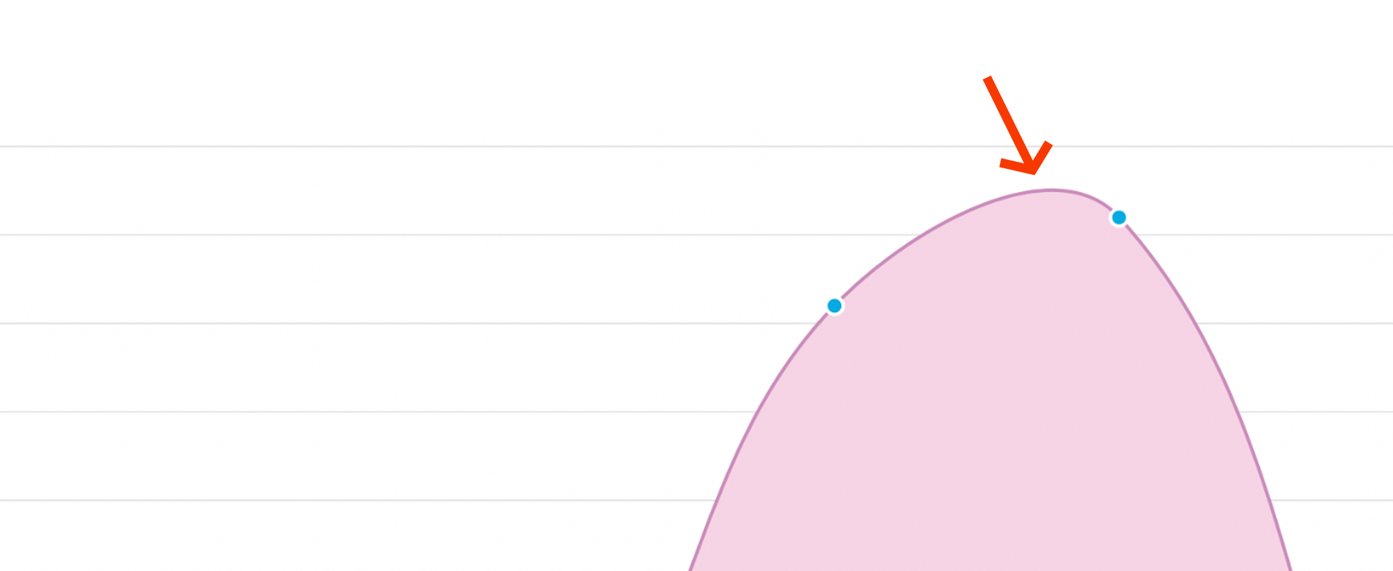
when, in fact, it’s not. The peak is exactly at the blue spot to the right of the arrow. Since this is a visualization of a discrete data set (downloads per day), in fact, there are not even any data points in between the blue points at all. It just doesn’t make sense to assume that any day could lie between two consecutive days. Therefore, it’s inappropriate to suggest that higher data points exist. They can’t. They don’t. The max number of downloads is at the position of the blue spot to the right of the arrow.
By trying to make the chart look more beautiful, the designers have made it wrong. They’ve compromised accuracy for the sake of making it look nicer. And so they destroy trust in the data.
When in doubt, always choose accuracy. Trust isn’t created by beauty, it’s created by saying what you mean. This chart doesn’t say what it means. (The irony being that to me an accurate chart would look just as nice, just not with rounded curves; clearly a personal taste thing.)